DVB201: Typographic Design
Assessment 2: Typographic Composition and Editorial Design
By Tess Mulcahy n11236078
This zine focuses on the Amandine typeface and explores its origins and its classification as a slab serif. The zine also discusses its creator, Elena Genova and her career as a typographer. Moreover, it discusses current trends within the design landscape and its relevance to the Amandine font.
Research
The research entailed gathering inspiration for the visual style of the zine while also uncovering the history of the typeface’s creator, Elena Genova, and the Amandine fonts' history and applications. Moreover, research on Amandine's inspirations, Diodine typefaces, was also conducted to further explore the typefaces origins.
Inspiration
Pham, 2024
(Geneva, 2022)
Concepting
Development
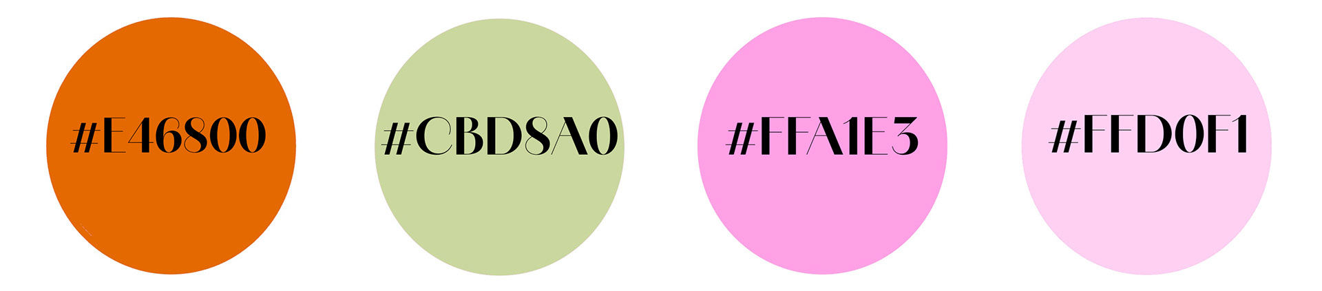
Colour Palette:
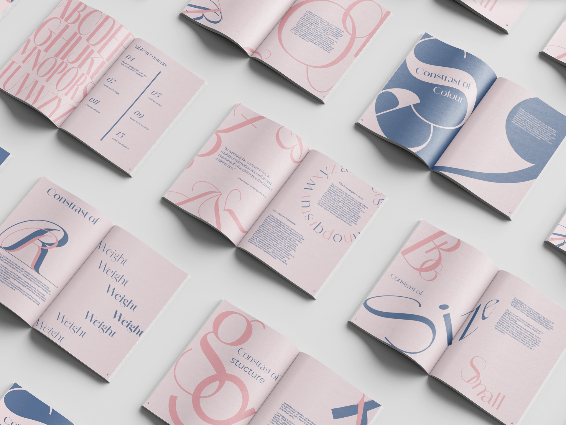
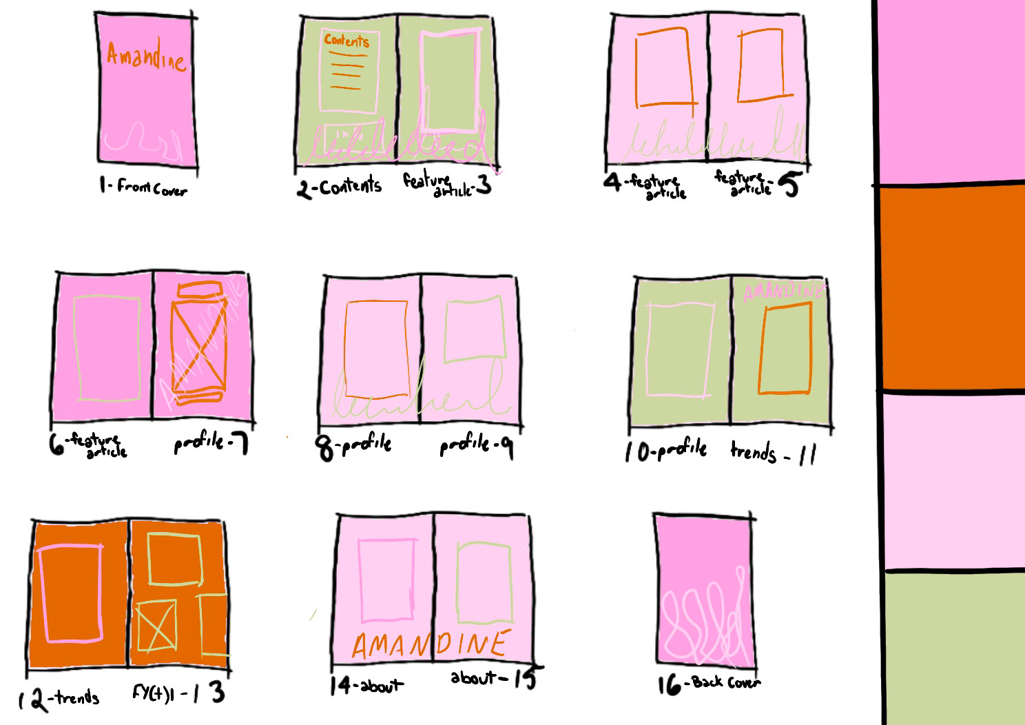
Zine Content: Text + Images
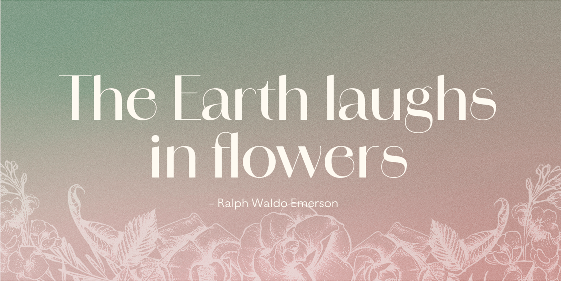
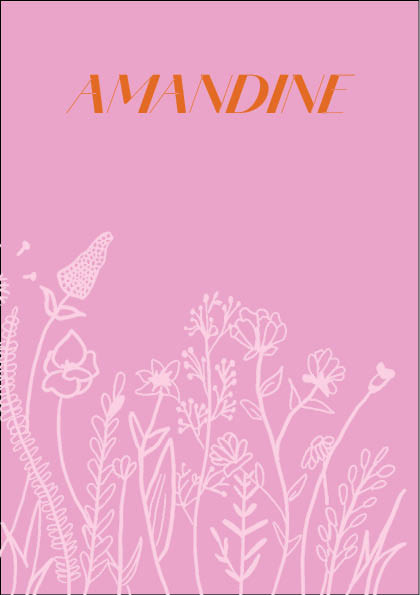
Page 1
Text:
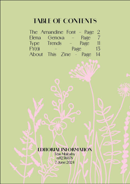
The Amandine Font – Page 2
Elena Genova – Page 7
Type Trends – Page 10
FY(t)i – Page 12
About This Zine - Page 13
Image:
Pastel sage green background with pastel pink wildflowers
Page 2: Feature article - The Armandine Font
Text:
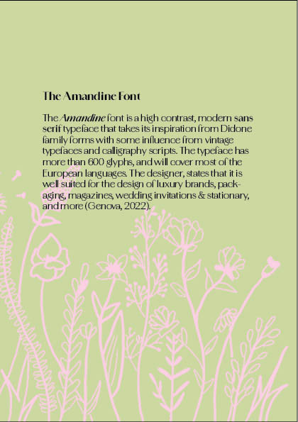
The Amandine Font
The Amandine font is a high contrast, modern sans serif typeface that takes its inspiration from Didone family forms with some influence from vintage typefaces and calligraphy scripts. The typeface has more than 600 glyphs, and will cover most of the European languages. The designer, states that it is well suited for the design of luxury brands, packaging, magazines, wedding invitations & stationary, and more (Genova, 2022).
Image:
Pastel sage green background with pastel pink wildflowers
Page 3: Feature article - The Armandine Font
Text:
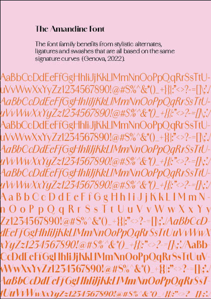
The font family benefits from stylistic alternates, ligatures and swashes that are all based on the same signature curves (Genova, 2022).
Image:
Pastel pink background with rows of the Amandine typeface of varying weights in orange
Page 4: Feature article - The Armandine Font
Text:
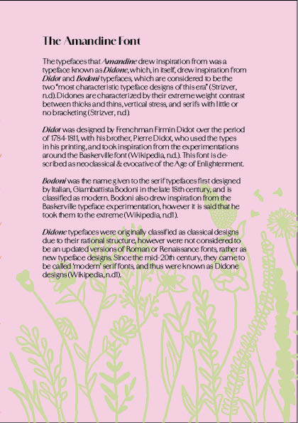
The typefaces that Amandine drew inspiration from was a typeface known as Didone, which, in itself, drew inspiration from Didot and Bodoni typefaces, which are considered to be the two “most characteristic typeface designs of this era” (Strizver, n.d). Didones are characterized by their extreme weight contrast between thicks and thins, vertical stress, and serifs with little or no bracketing (Strizver, n.d).
Didot was designed by Frenchman Firmin Didot over the period of 1784-1811, with his brother, Pierre Didot, who used the types in his printing, and took inspiration from the experimentations around the Baskerville font (Wikipedia, n.d.). This font is described as neoclassical & evocative of the Age of Enlightenment.
Bodoni was the name given to the serif typefaces first designed by Italian, Giambattista Bodoni in the late 18th century, and is classified as modern. Bodoni also drew inspiration from the Baskerville typeface experimentation, however it is said that he took them to the extreme (Wikipedia, n.d1).
Didone typefaces were originally classified as classical designs due to their rational structure, however were not considered to be an updated versions of Roman or Renaissance fonts, rather as new typeface designs. Since the mid-20th century, they came to be called ‘modern’ serif fonts, and thus were known as Didone designs (Wikipedia, n.d1).
Image:
Pastel pink background with pastel sage green wildflowers
Page 5: Feature article - The Armandine Font
Text:
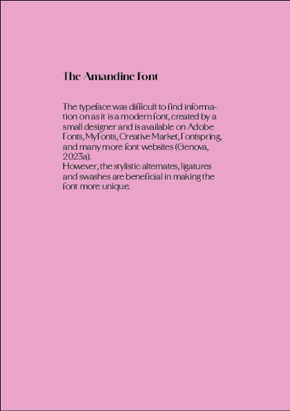
The typeface was difficult to find information on as it is a modern font, created by a small designer and is available on Adobe Fonts, MyFonts, Creative Market, Fontspring, and many more font websites (Genova, 2023a).
However, the stylistic alternates, ligatures and swashes are beneficial in making the font more unique.
Image:
Hot pink background
Page 6: About the Artist
Text:
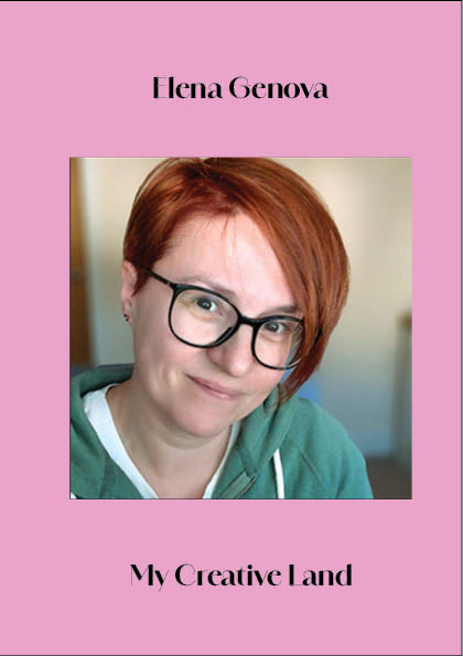
Elena Genova
My Creative Land
Image:
Hot pink background with photo of designers' face in the middle of the page
Page 7: About the Artist
Text:
Elena Genova
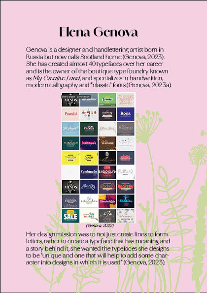
Genova is a designer and handlettering artist born in Russia but now calls Scotland home (Genova, 2023). She has created almost 40 typefaces over her career and is the owner of the boutique type foundry known as My Creative Land, and specializes in handwritten, modern calligraphy and “classic” fonts (Genova, 2023a).
Her design mission was to not just create lines to form letters, rather to create a typeface that has meaning and a story behind it, she wanted the typefaces she designs to be “unique and one that will help to add some character into designs in which it is used” (Genova, 2023).
Image:
Pastel pink background with pastel sage green wildflowers and screenshot of Genova's typography portfolio.
Page 8: About the Artist
Text:
Elena Genova
For Genova, handwriting is always something she felt passionate about, according to her About page on her website, My Creative Land, the passion for handwriting formed when she was in school, and it didn’t go away once she hit adulthood (Genova, 2023).
Genova has been a designer since 2001, and a typography designer for almost 10 years (LinkedIn, 2024), however has been focusing on handlettering & calligraphy since around 2018 (Genova, 2023).
Image:
Pastel pink background with pastel sage green wildflowers
Page 9: About this Zine
Text:
Creating this zine was a lot more time consuming than I initially thought.
The initial decision on fonts was surprisingly difficult, as I was indecisive over a few options. As the chosen font was provided on Adobe Fonts and not a standard Microsoft Office or a font that is well known, it was difficult finding the relevant information on the typeface and the creator of the typeface.
Image:
Orange background with pastel pink wildflowers
Page 10: About this Zine
Text:
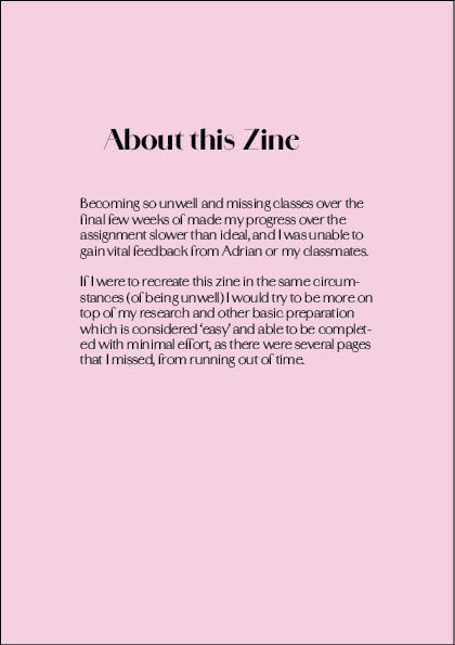
Being so unwell over the final few weeks of classes made my progress over the assignment slower than ideal, and I was unable to gain vital feedback from Adrian or my classmates.
If I were to recreate this zine in the same circumstances (of being unwell) I would try to be more on top of my research and other basic preparation which is considered ‘easy’ and able to be completed with minimal effort, as there were several pages that I missed, from running out of time.
Image:
Pastel pink background
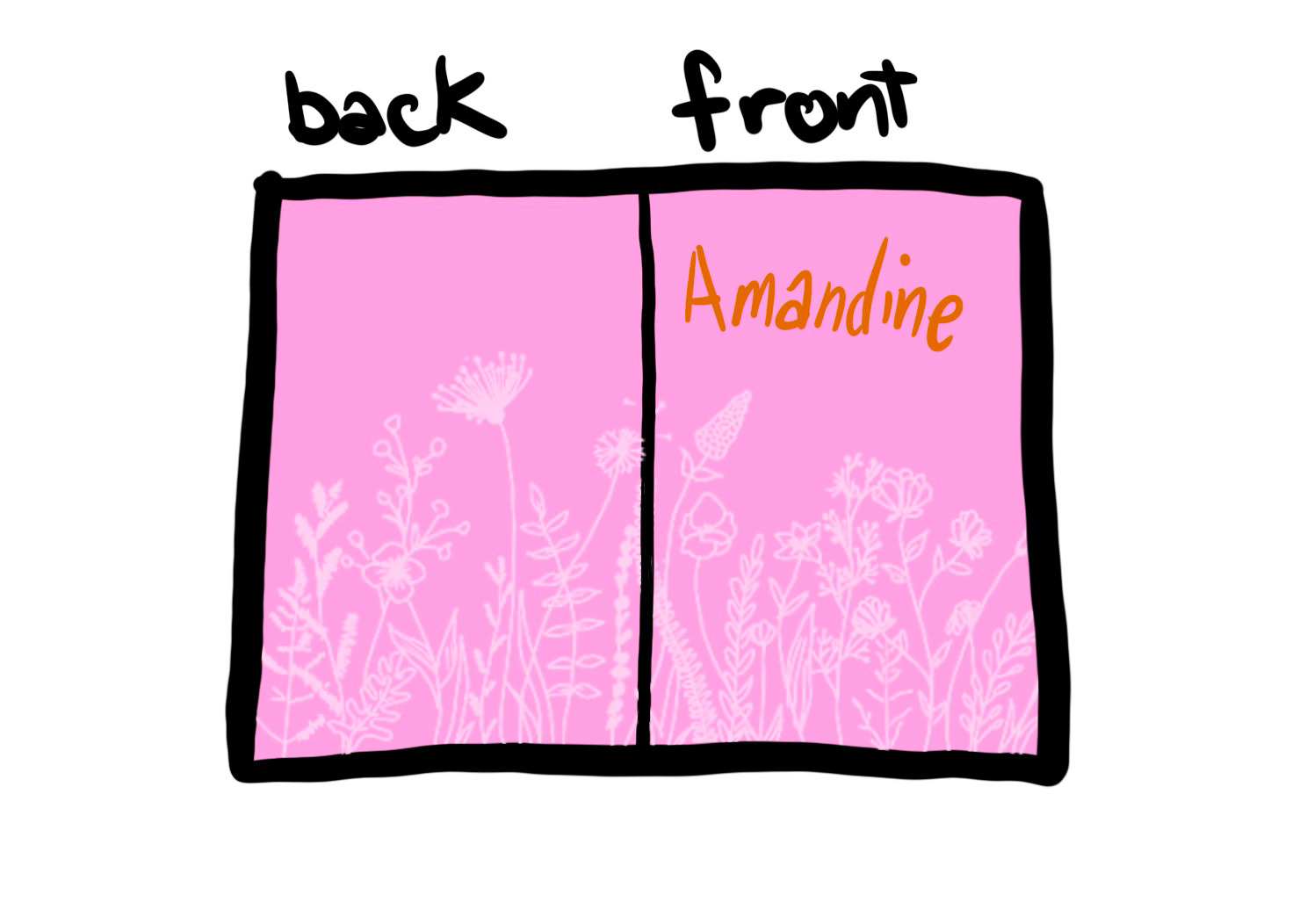
Page 11: back cover
Image:
Pink background with pastel pink wildflowers
Final Zine
References
Genova, E. (2022). Amandine Font Family. Retrieved from Behance: https://www.behance.net/gallery/136794773/Amandine-Font-Family
Genova, E. (2023). About. Retrieved from My Creative Land: https://www.mycreativeland.com/about
Genova, E. (2023a). Home. Retrieved from My Creative Land: https://www.mycreativeland.com/
Genova, E. (n.d). Amandine. Retrieved from Adobe Fonts: https://fonts.adobe.com/fonts/amandine
Genova, E. (n.d). Elena Genova. Retrieved from Adobe Fonts: https://fonts.adobe.com/designers/elena-genova
LinkedIn. (2024). Elena Genova profile. Retrieved from LinkedIn: https://www.linkedin.com/in/genova/
Pham, C. (2024). DVB201-Typographic Contrast Zine. Retrieved from Behance: https://www.behance.net/gallery/200201009/DVB201-Typographic-Contrast-Zine?moduleId=1134812335&action=moodboard
Strizver, I. (n.d). Guide to Typestyles: Didone Typefaces. Retrieved from MyFonts: https://www.myfonts.com/pages/fontscom-learning-fontology-level-1-type-families-didone
Wikipedia. (n.d). Bodoni. Retrieved from Wikipedia: https://en.wikipedia.org/wiki/Bodoni
Wikipedia. (n.d). Didot (typeface). Retrieved from Wikipedia: https://en.wikipedia.org/wiki/Didot_(typeface)